


Color is more than just a decorative element of an exhibition stand. It’s a powerful tool of nonverbal communication, capable of influencing visitors’ emotions, behavior, and decisions long before they even begin. Proper use of color palette not only helps attract your target audience from the crowd but also significantly increases their time spent at your site, creating a comfortable and engaging environment.
Scientific Basis: How Color Affects Perception
Color perception is a deeply psychophysiological process. Different wavelengths of light affect the nervous system, evoking specific associations and states. For example, warm tones (red, orange) are stimulating, increase heart rate, and attract attention. Cool tones (blue, green) are calming, promote concentration, and are perceived as reliable. Understanding these basic reactions allows you to develop a design strategy that supports specific business goals.
Choosing a Palette: From General Atmosphere to Targeted Impact
The key principle is that color should align with the brand image, industry, and purpose of the exhibition.
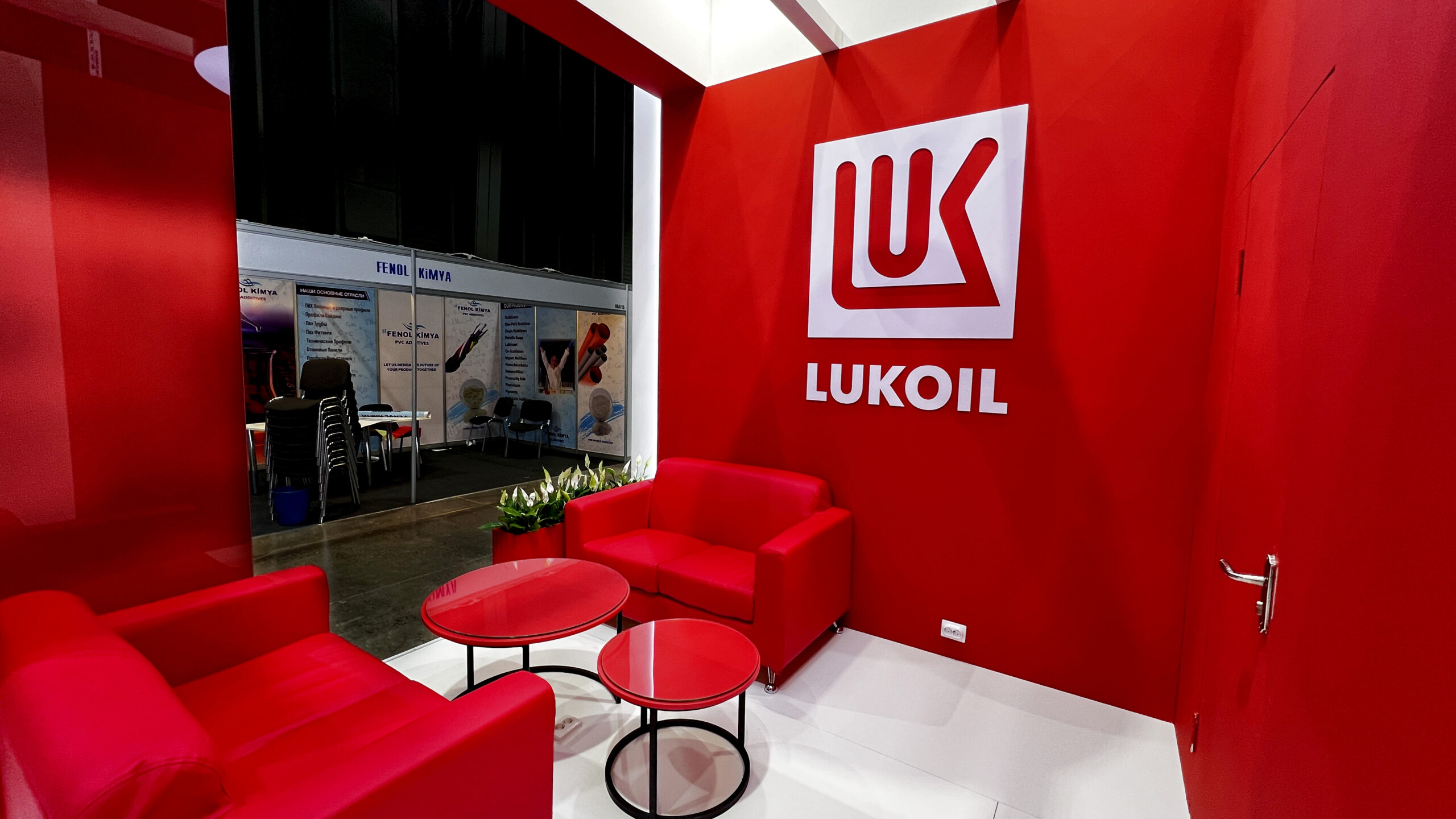
- Blue: The color of trust, security, and stability. Ideal for IT companies, banks, industrial enterprises, and healthcare. Deep shades of blue encourage long-term lingering, creating an atmosphere of professional seriousness.
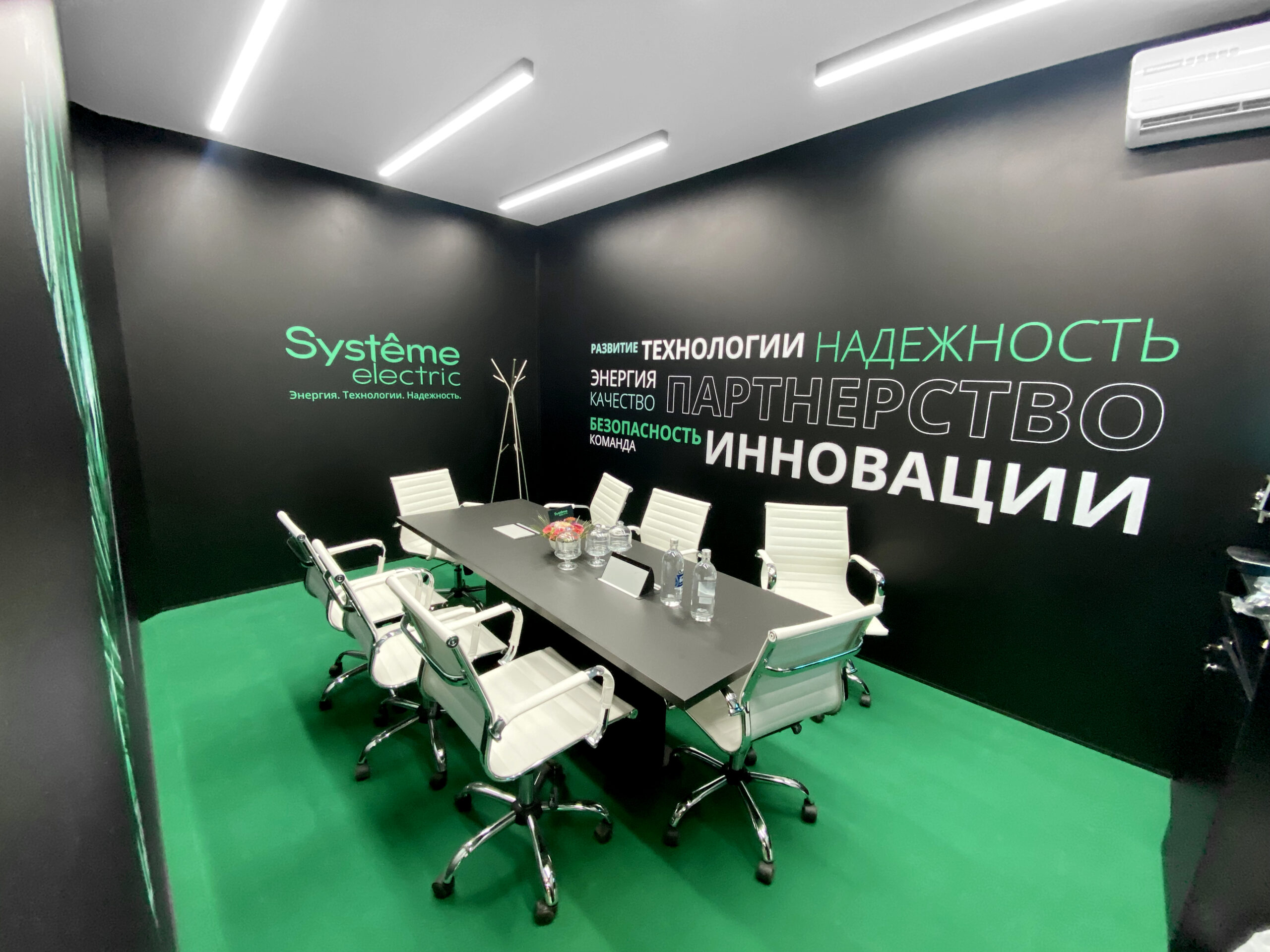
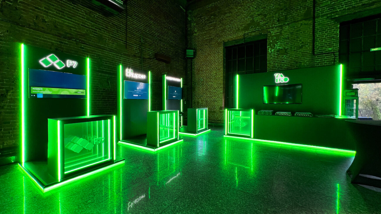
- Green: Associated with growth, nature, harmony, and finance. Suitable for environmental projects, pharmaceuticals, and the wellness industry. Reduces visual stress, making the booth experience more comfortable.
- Red: The color of energy, passion, and urgency. It attracts attention immediately, but too much can be tiring. Effective for accents, calls to action (buttons, important information), and the food and entertainment industries.
- Yellow/Orange: Tones of optimism, creativity, and friendliness. They stimulate communication and attract the eye. Work great for startups, advertising agencies, and education. They brighten the space.
- Black, Gray, White: The colors of elegance, minimalism, and technology. Premium black focuses attention on the product, white creates a sense of spaciousness and purity, and gray serves as the perfect neutral background for contrasting accents.
Color Schemes for Specific Goals
- Attention-Getting (Traffic): Use contrasting combinations and warm accents against a neutral base. A bright spot in the far field of view attracts traffic. For example, an orange detail on a dark blue background.
- Increasing dwell time: Calm, but not dull, tones should dominate—muted greens, deep blues, and complex gray-blue hues. They don’t overwhelm and allow visitors to relax. It’s important to add lively accents in active areas.
- Encouraging interaction: Negotiation and sampling areas can be lightly painted in warm, social colors—terracotta, soft yellow, and olive. These encourage openness and dialogue.
- Brand image development: Strict adherence to a signature palette strengthens brand recognition. The designer’s task is to adapt corporate colors to a large space by correctly placing accents and selecting background shades.
Practical Tips for Application
- The 60-30-10 Rule: 60% of the space is the main color (walls, large structures), 30% is the secondary color (furniture, graphics), and 10% is the accent color (calls to action, key elements).
- Considering Lighting: Color changes under spotlights and lamps. All samples should be tested under the lighting that will be used at the exhibition.
- Target Audience: Color preferences may vary depending on the gender, age, and culture of the audience. Blue, green, and neutral tones are considered a gender-neutral and often winning palette.
- Competitive Environment: Analyze the palettes of your direct competitors’ booths. Using a contrasting scheme will help you visually differentiate yourself.
Color in exhibition design is a strategy, not decoration. A well-thought-out palette works like a quiet but persuasive salesperson: it attracts the right people, creates the right mood, and retains guests, forming a strong emotional connection with the brand even before the first handshake.
Learn more:
To ensure everything goes smoothly, it's important to understand how the entire work cycle works. W...

Find out how double-decker exhibition stands compare favorably to regular ones: advantages, design ...
